Overview
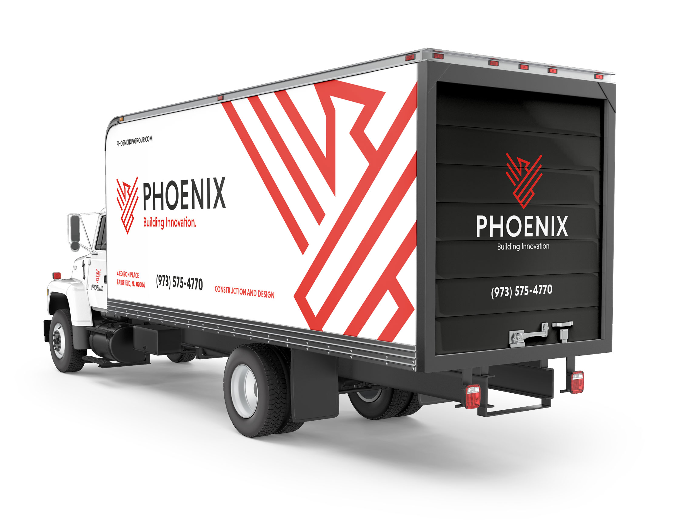
Phoenix Diversified Group came to GreyBox looking to update their brand. We began with an in-depth discovery phase that examined and identified who they are as a company gaining a deeper understanding of their; customer, culture and competition. It was in the workshop that we identified their key differentiators and established their positioning, core messaging and established the new tagline.
Solution
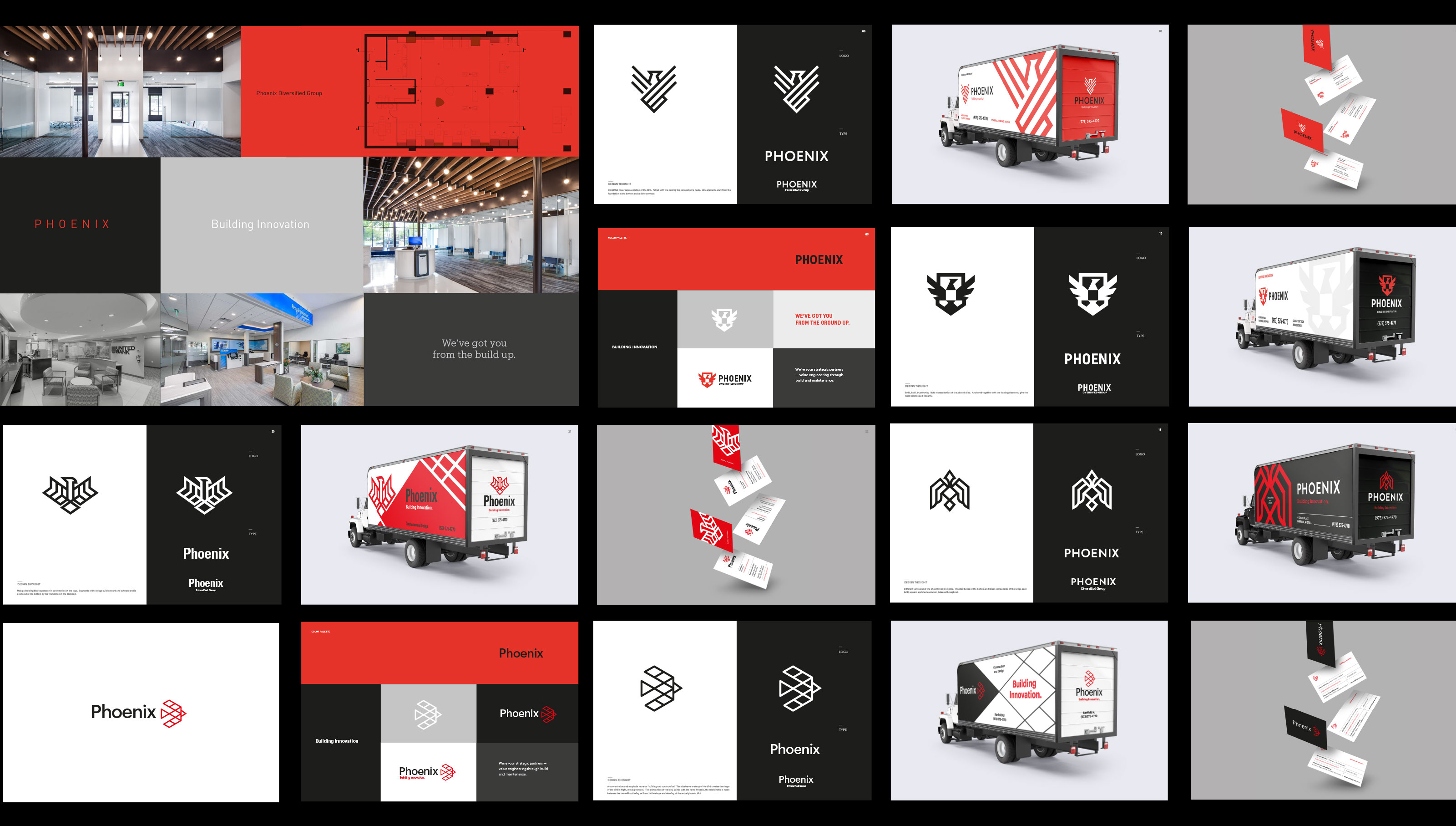
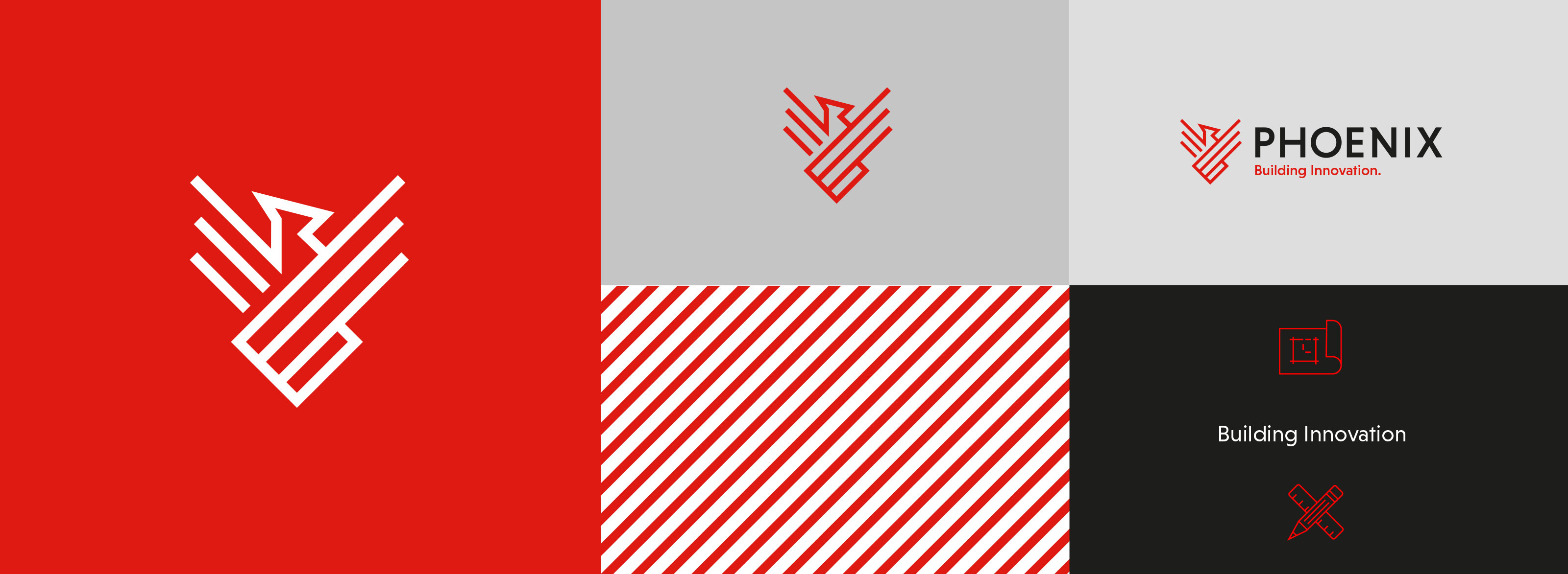
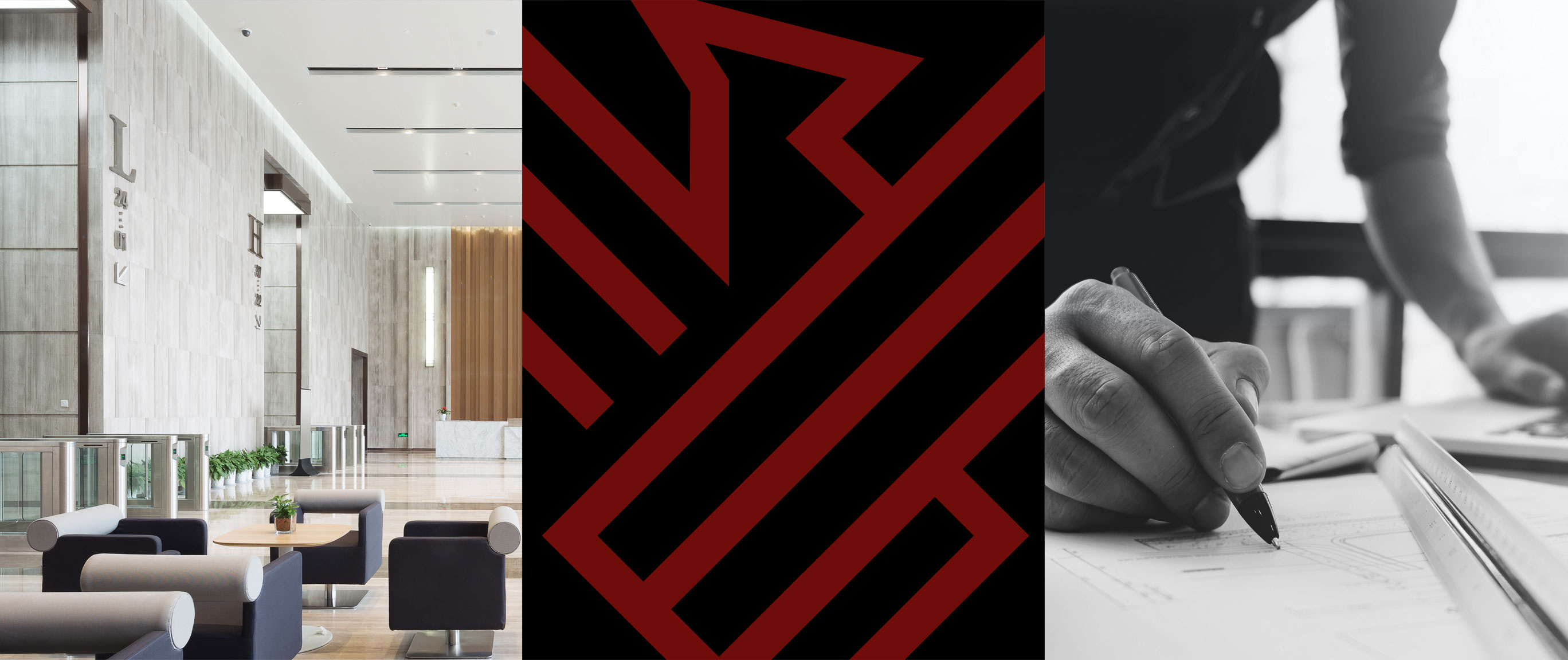
The Phoenix Diversified Group name was shortened to Phoenix. The tagline “Building Innovation” was our springboard to begin our creative work. Our first step of the design process began with the logo, with the agreement of using the Phoenix bird as a strong identifier for the firm. The existing color palette of red and black was set by the client from the beginning. We pitched various concepts meshing together the idea of “building” and the bird construct. The final mark chosen perfectly captures the essence of building and the phoenix bird. Simplistic lines start at a foundation and extend upward and out, like many of their building projects.
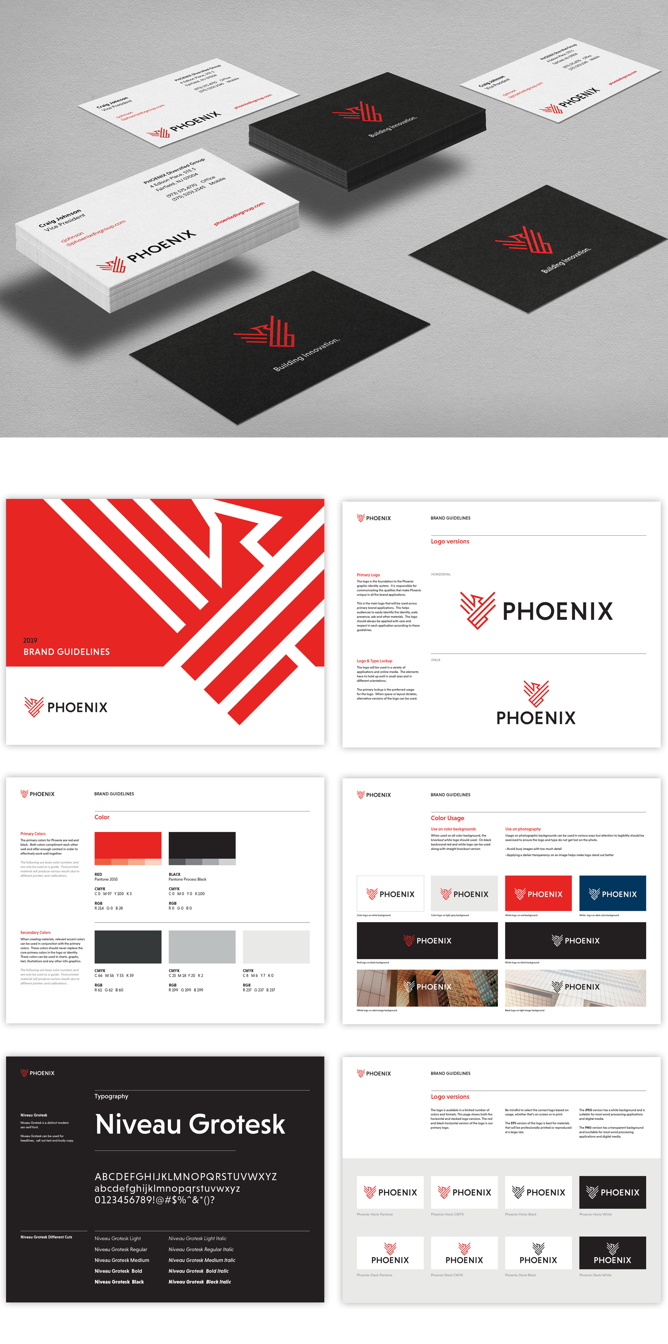
In addition, GreyBox created brand guidelines establishing correct fonts, color and imagery for the brand moving forward. Their refined color palette, bold typography and new tone of voice build a strong brand that puts Phoenix at the forefront of building and construction and innovators within the industry. A new website highlights the core services Phoenix offers, showcasing their portfolio of projects along with their additional services of building maintenance and their special expertise in banking services.
