Overview
The Coleman Group is a mother-daughter led team of professional real estate agents operating in the greater Boston area and surrounding communities. They are well known for their vast experience in the real estate industry, their in-depth knowledge of the areas they operate and their hands-on approach to helping clients find the right home for their needs.

Solution
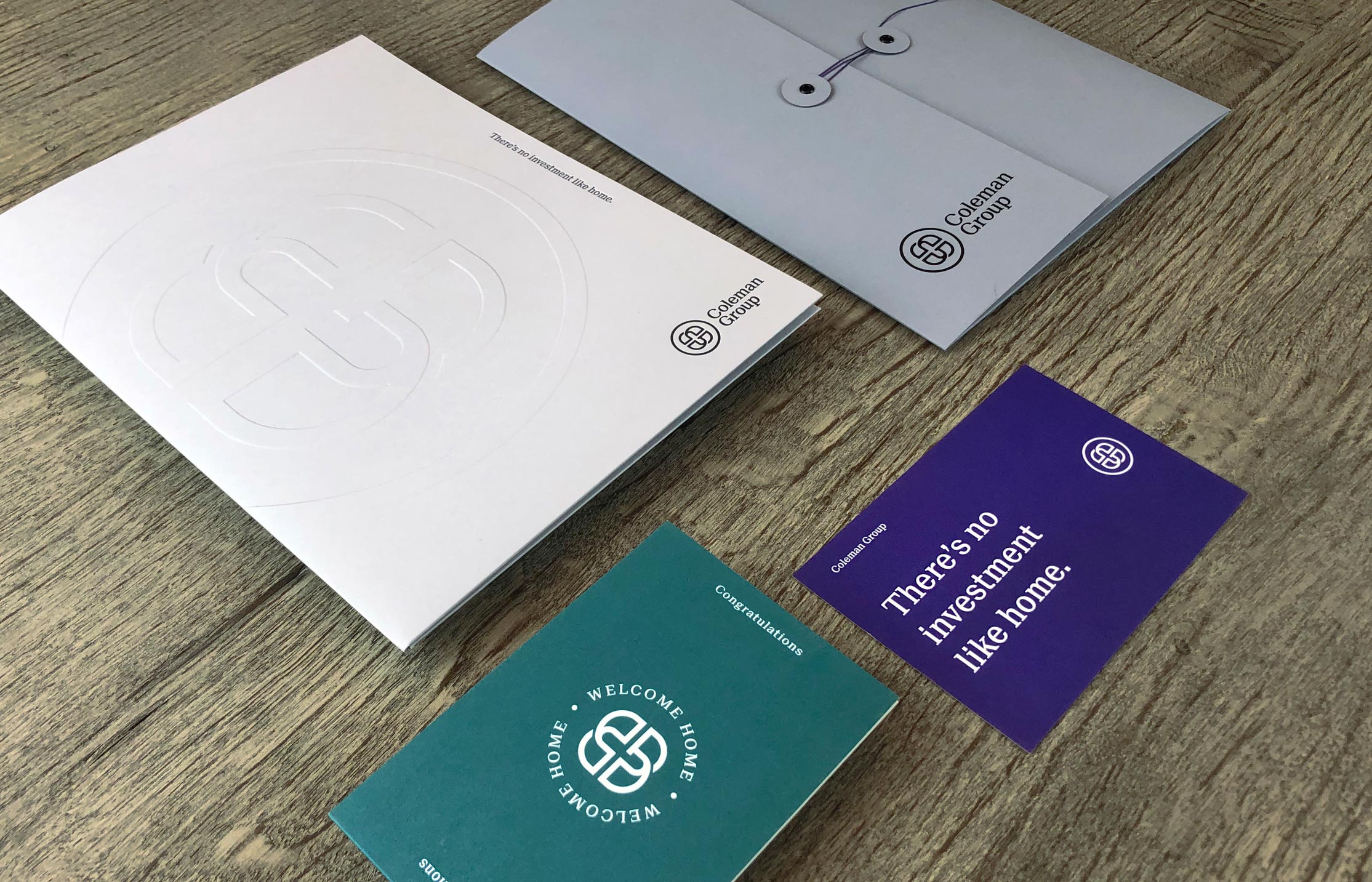
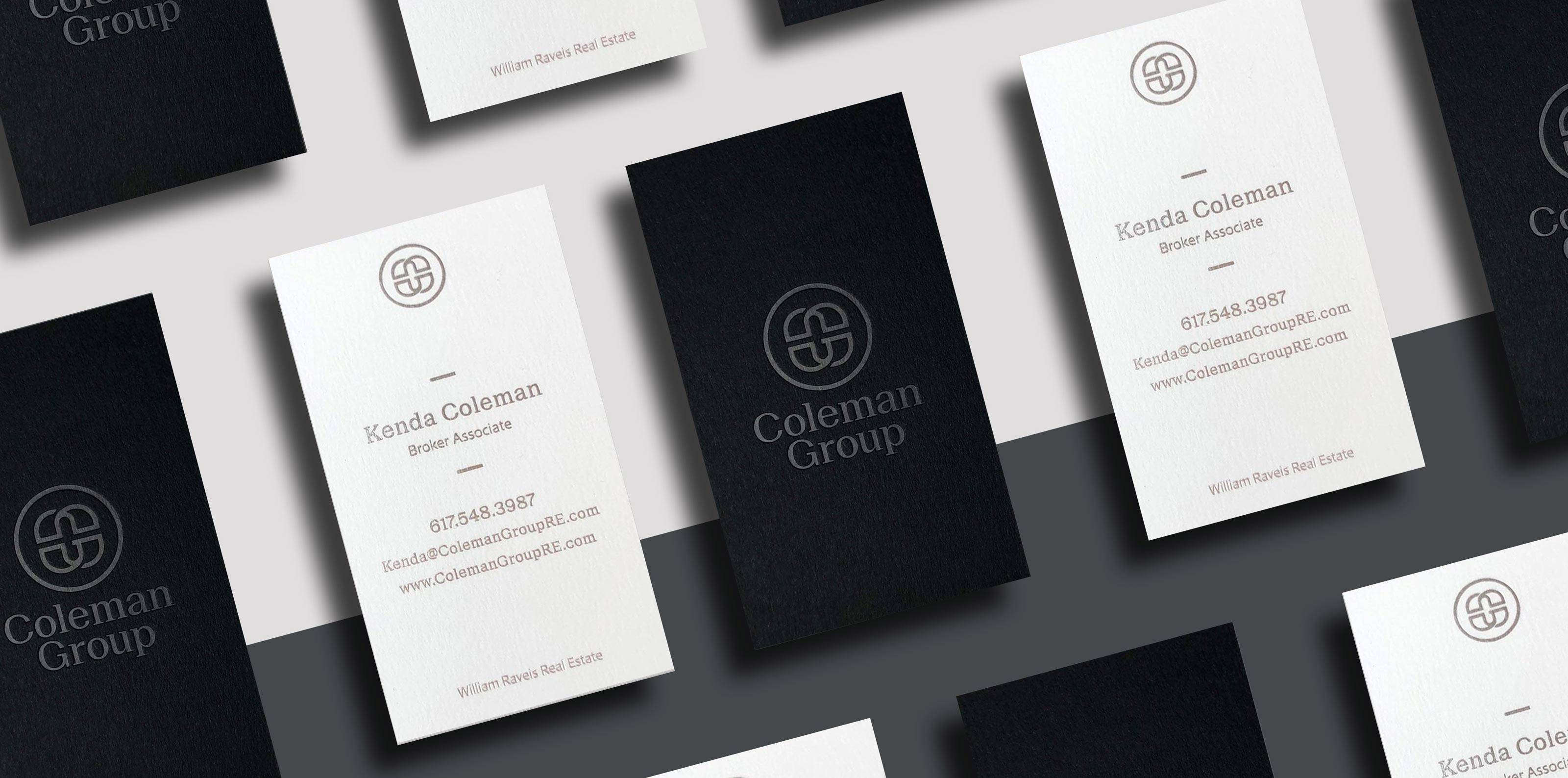
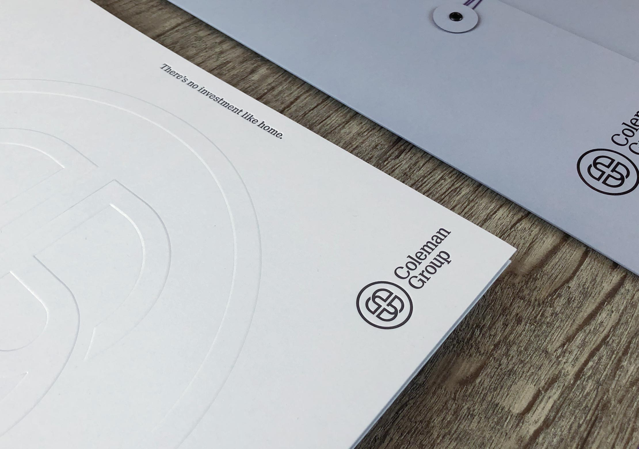
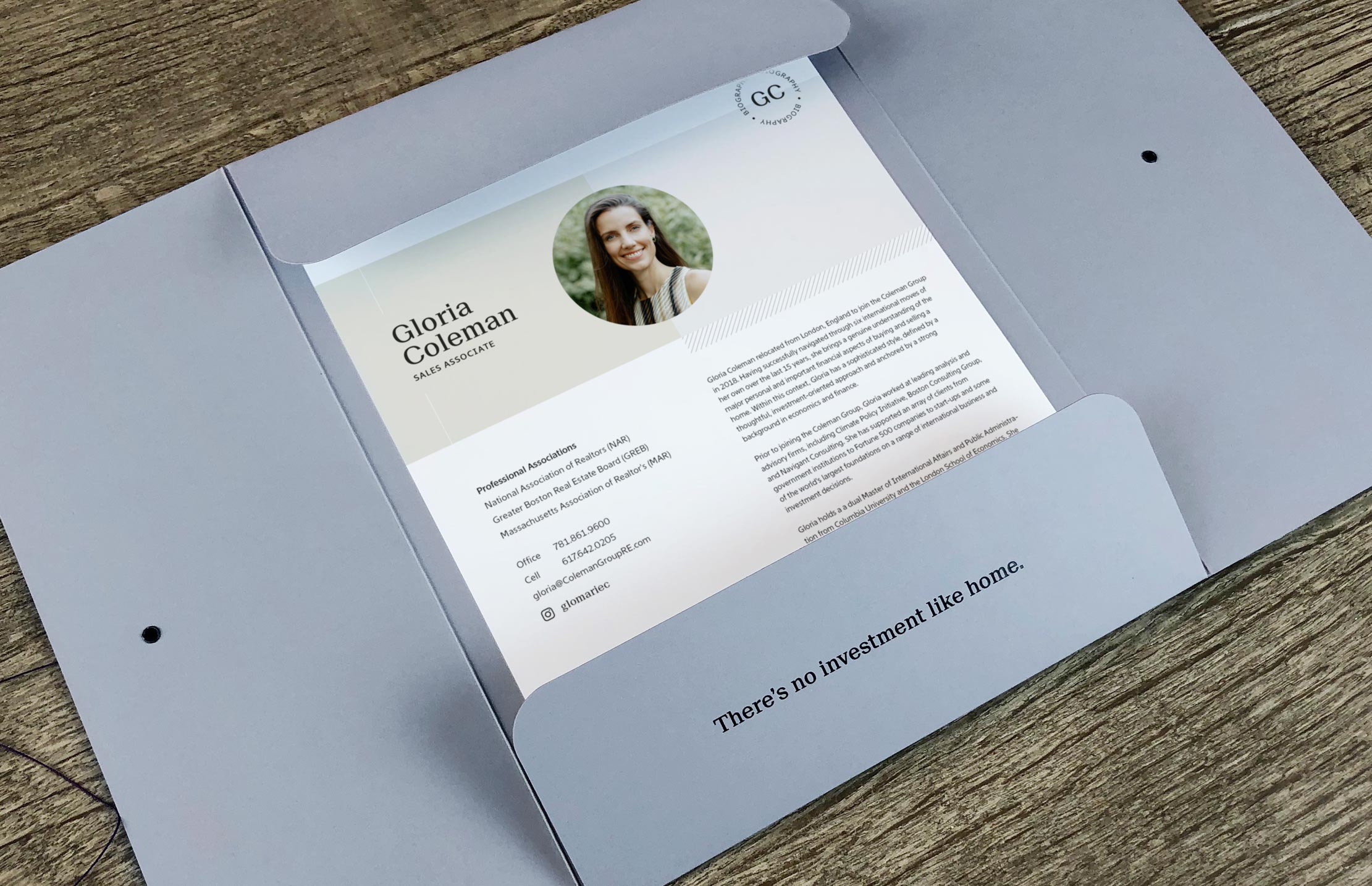
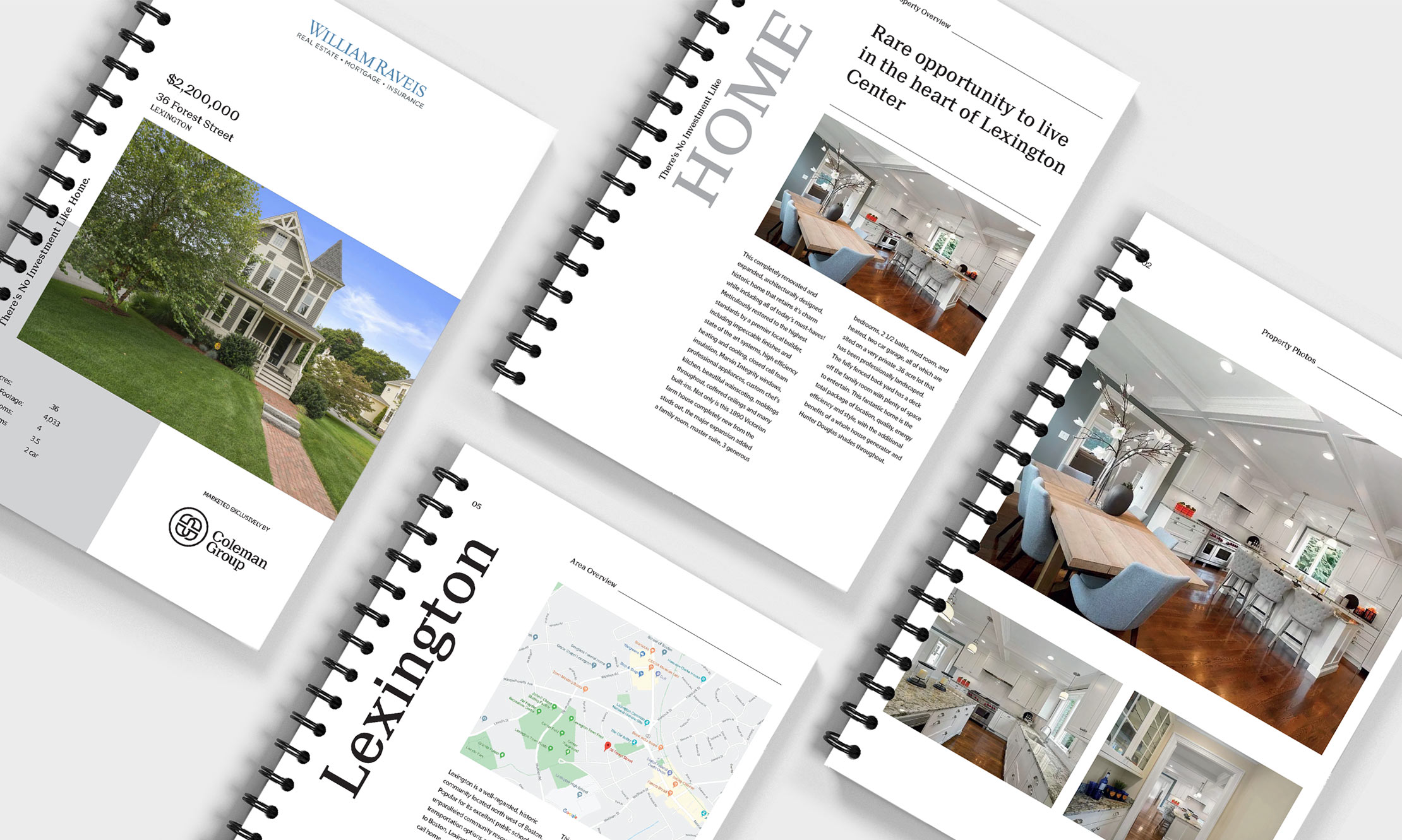
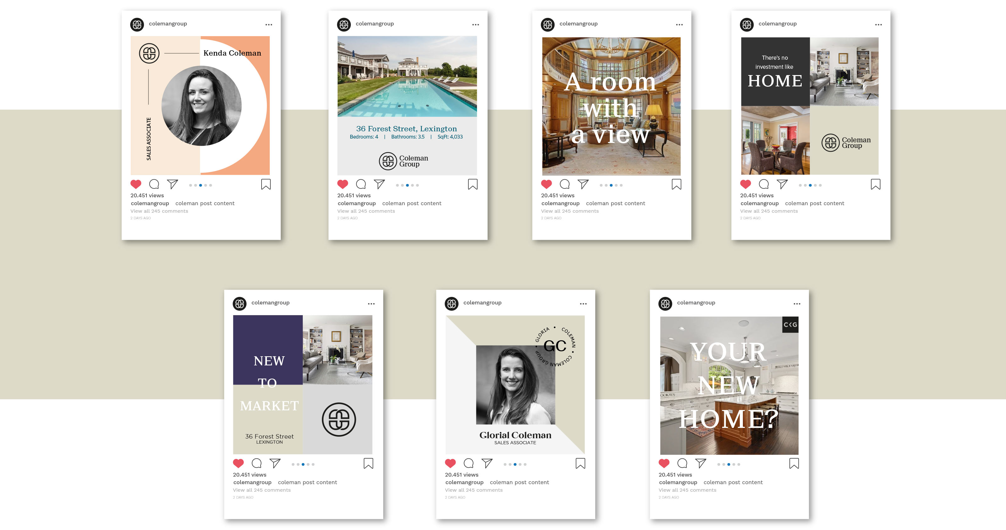
Starting with the logo, we designed a simple but strong lockup of the initials C & G that has a soft approachable feel. The overlapping constructs are symbolic of agent and client interacting and working together as one towards one simple goal. The color palette is simple and precise, black and greys paired with softer tones of grey and tan and peppered with splashes of color in certain areas of the brand. Throughout the branded pieces we developed; pocket folders, tie-string presentation folders and business cards, we mixed various paper colors and printing process’ utilizing blind embossing, black foil stamping and letterpress to make a dynamic and comprehensive brand identity.
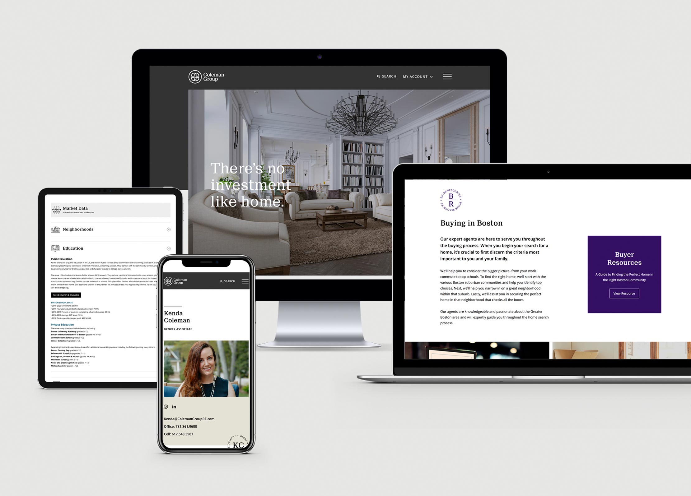
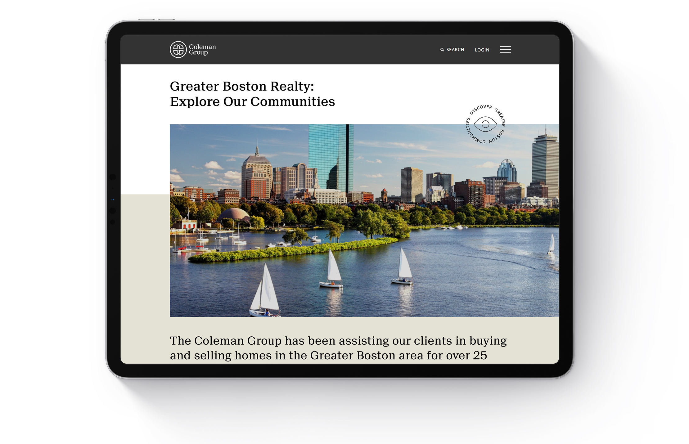
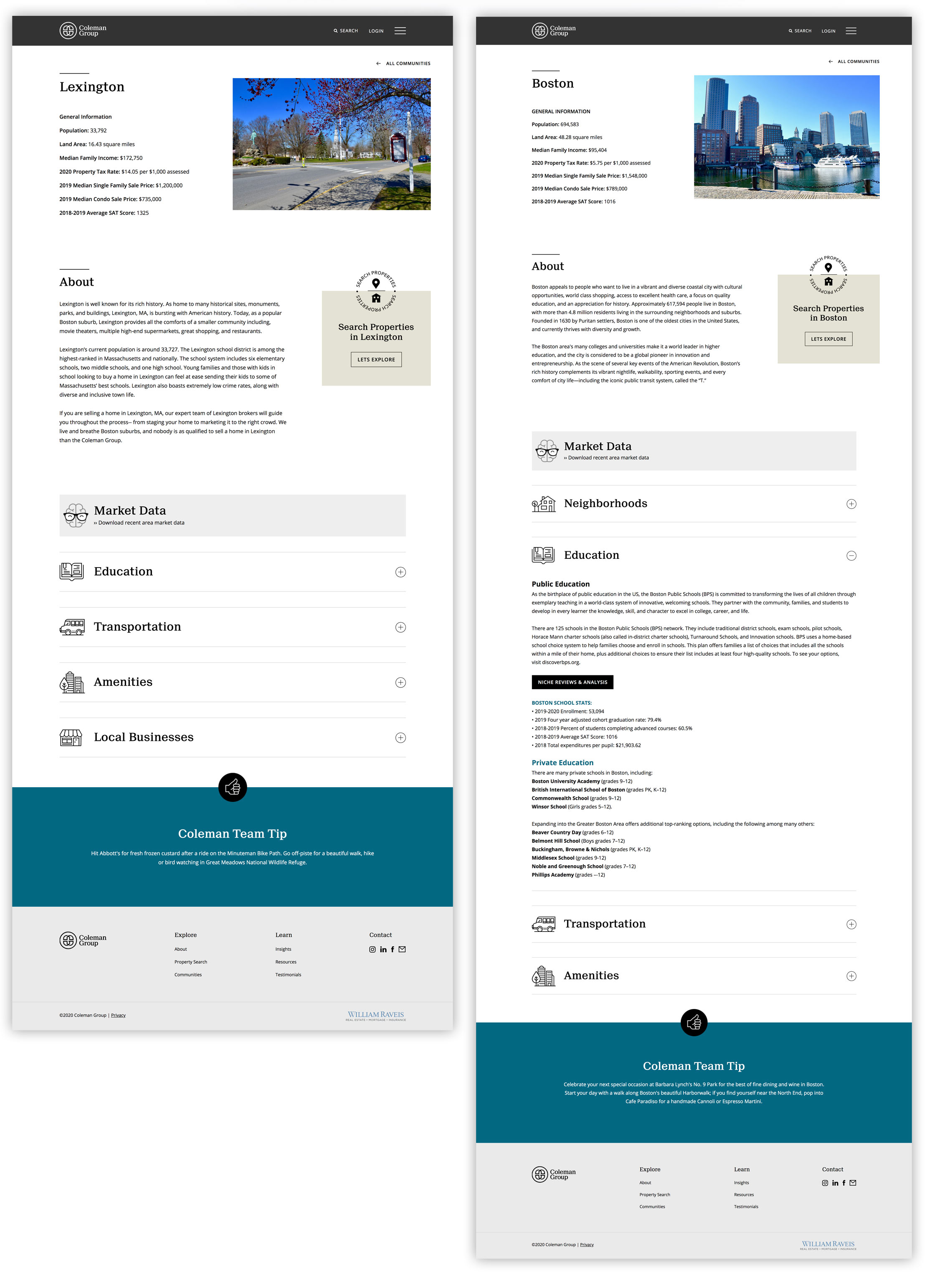
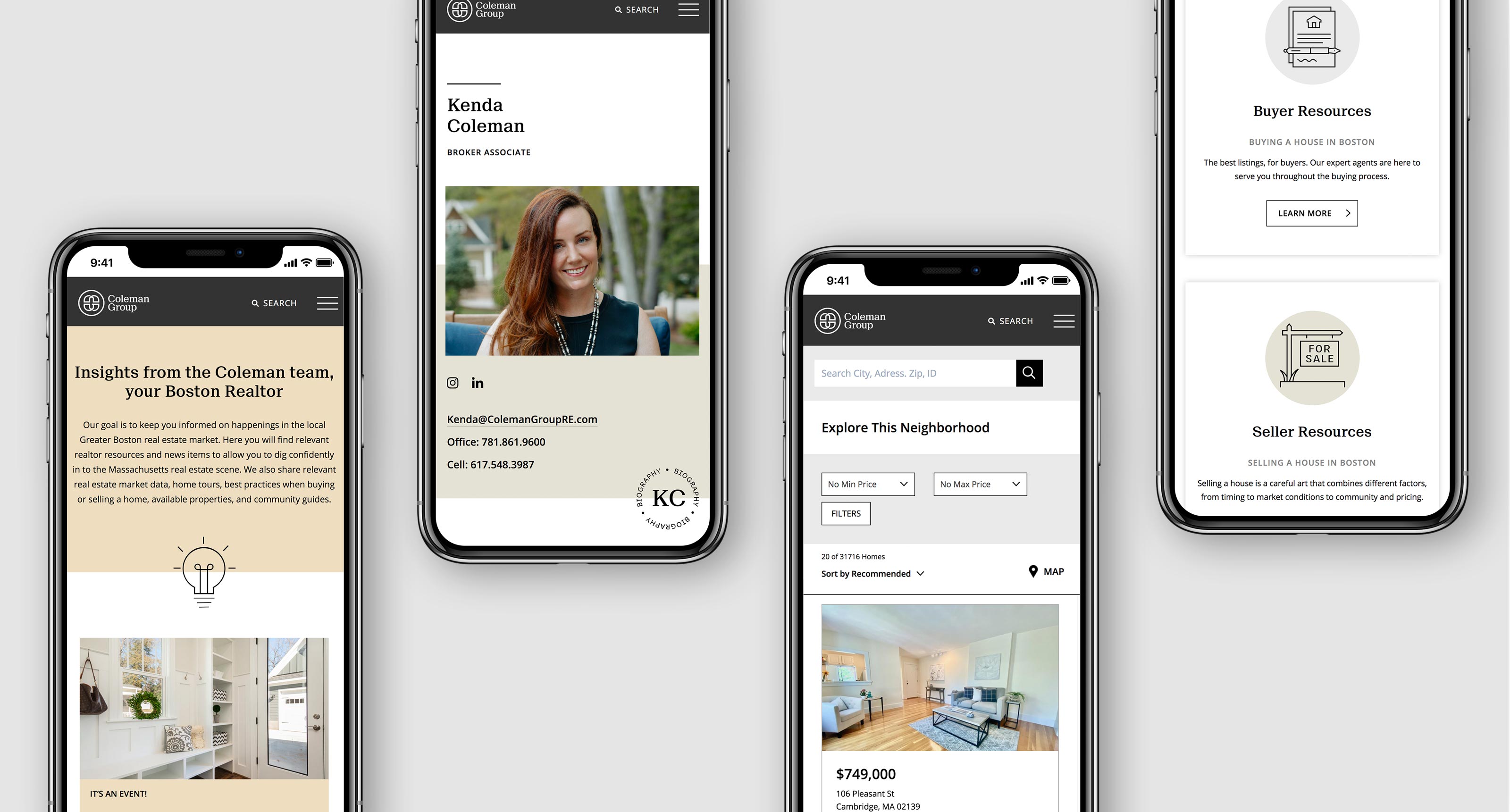
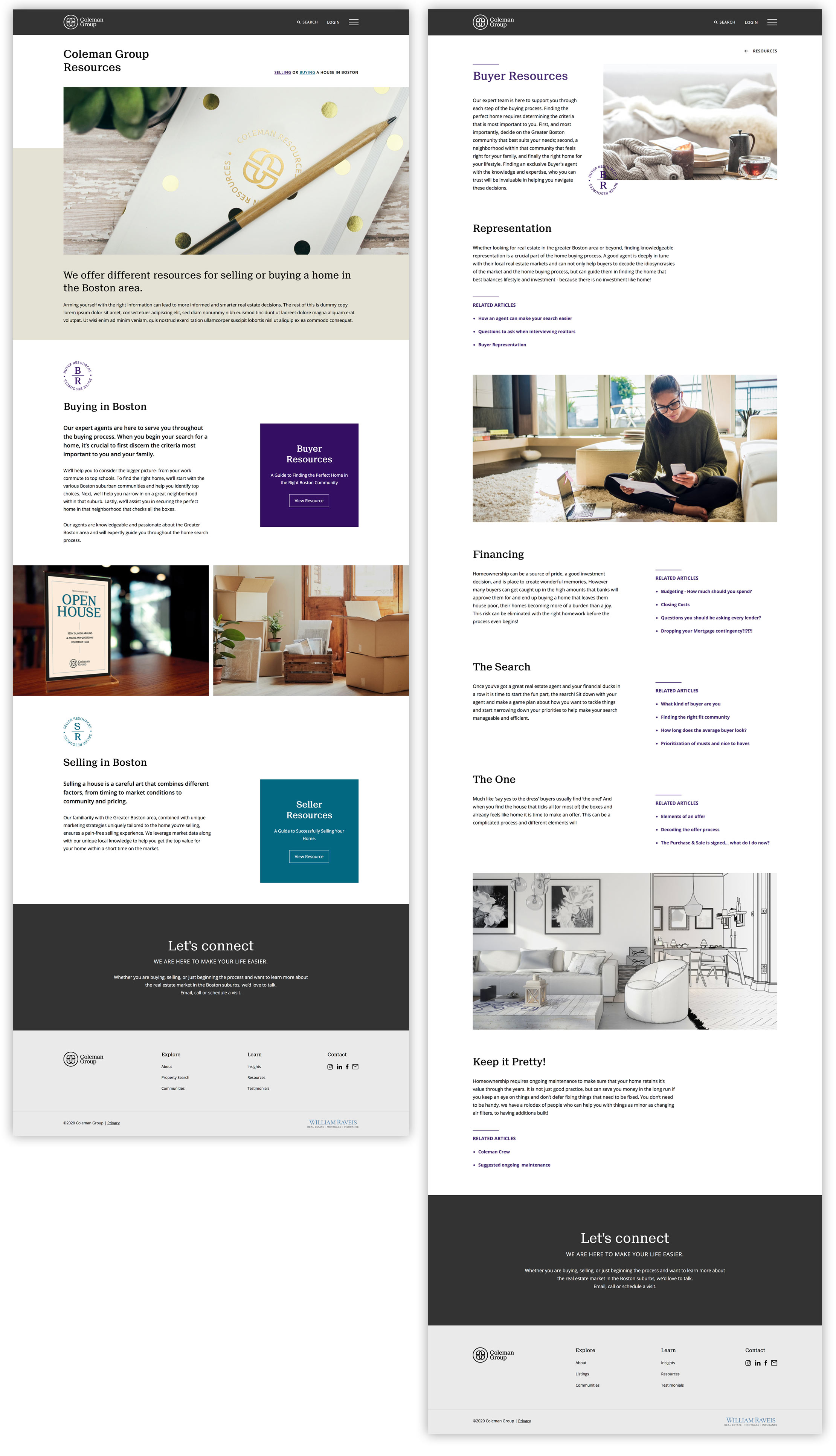
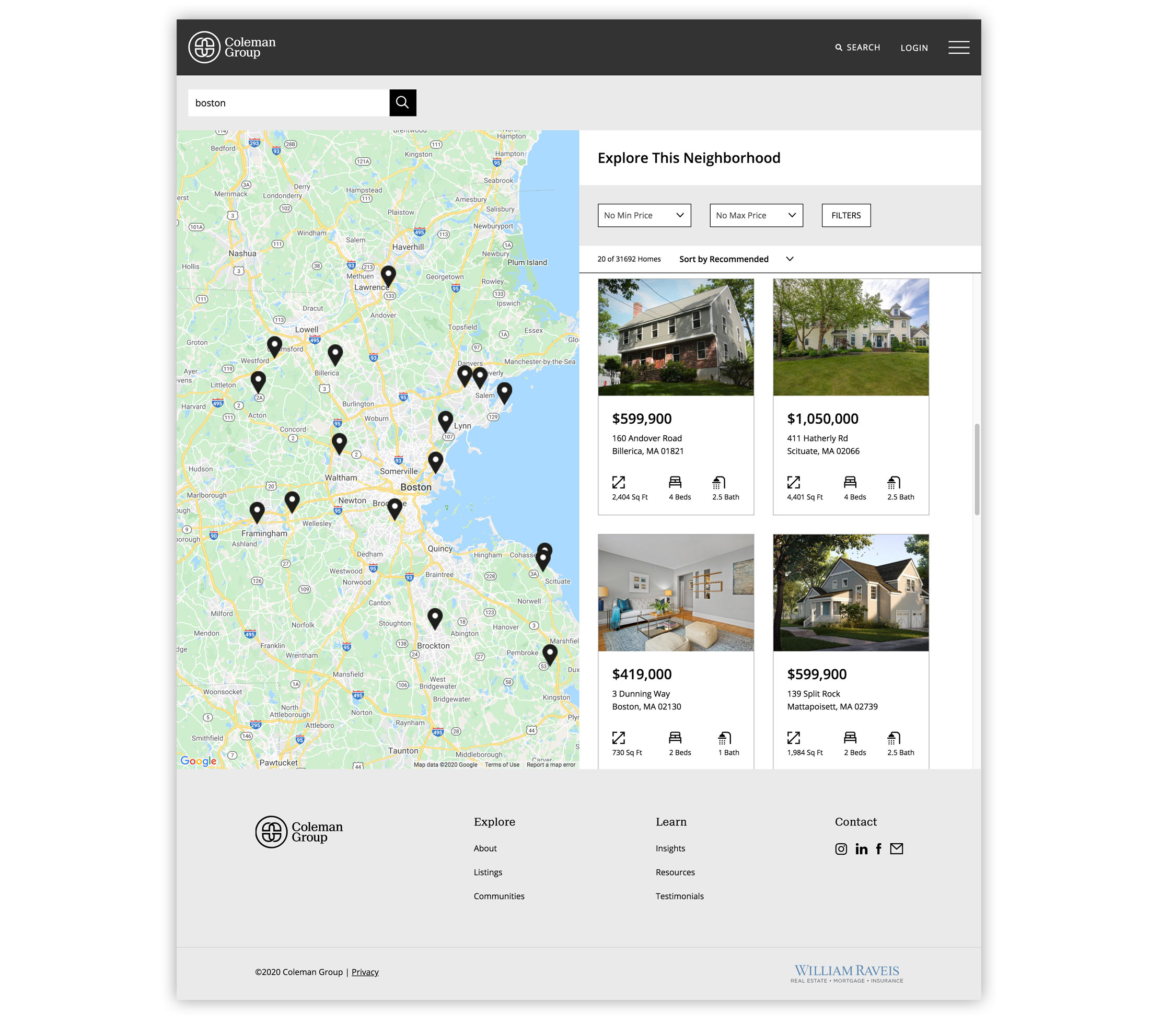
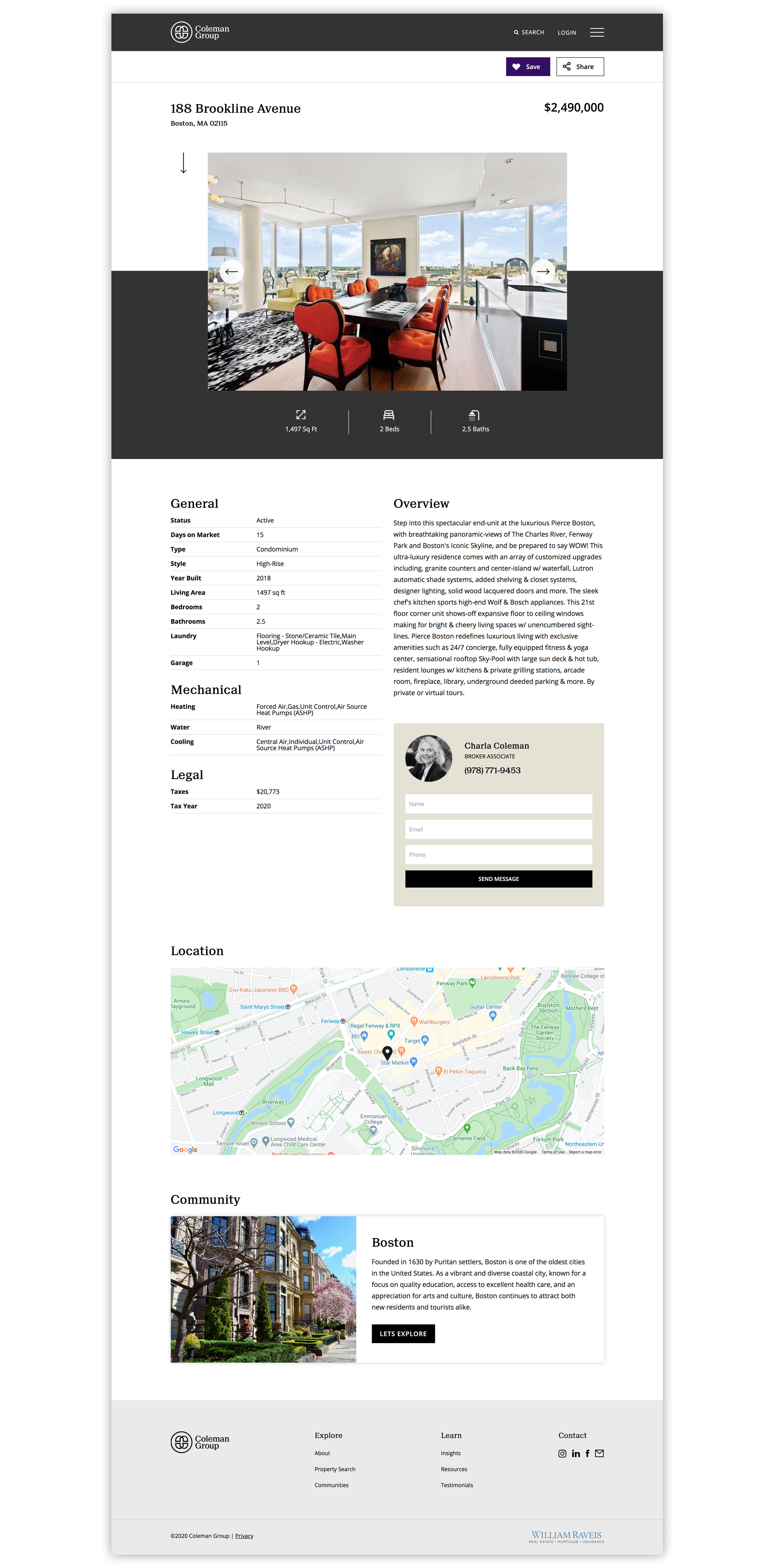
We custom designed and developed the fully responsive website to work with existing IDX platforms which allowed us to pull all information and display it how we wanted to work with the brand. The website allows user to explore Communities and gather information and statistics of chosen areas, including Education, Transportation, Local Business’ and Amenities. Comprehensive mapping and search criteria were developed in order to allow users to easily search Coleman’s listings and find what they are looking for.

