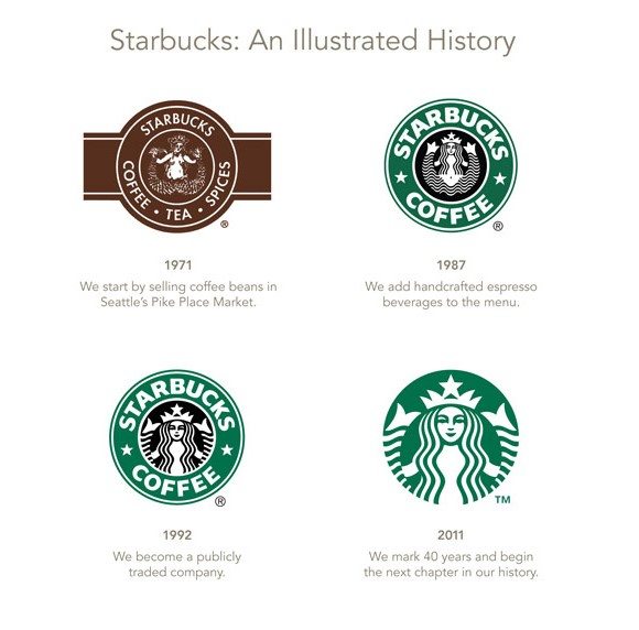
Any conversation regarding corporate identity almost always begins with the logo. As one of the primary tools for introducing a company or a brand to its target market, logo design calls for a considerable investment of time, effort, and other resources. In the case of the two examples below, logo design also demands the organizations’ commitment to adapt to the developments in the industry and offer something new to the customers. Starbucks. According to Marketing: An Introduction by Gary Armstrong and Philip Kotler, Starbucks was founded with the goal of bringing a European-style coffeehouse to America, and selling the so-called The Starbucks Experience, which is about “enjoying coffee to its fullest” and at the same time “enjoying life a little more.” In 1971, the Starbucks logo was a round brown seal with white text on it that said ‘Starbucks Coffee, Tea, and Spices.’ At the center of the circle is the now famous siren drawn in elaborate detail. By 1987, as it became more popular for its coffee-based products, it dropped the “Tea and Spices.” Furthermore, as it entered foreign markets, Starbucks adopted a tamer and flat version of the siren; its hair now covers its bosom, and the illustration became easier and cheaper to replicate. Then, in 2011, upon the advice of design firm Lippincott, the coffee brand opted for a minimalist design that focuses on balance, typography, less color, and the use of negative space. It dropped the ring of text, zoomed in on the siren, and prints Starbucks Coffee in solid black letters. Today, the Starbucks’ logo stands as a fine example of minimalism: it is simple, flat, and very catchy. National Broadcasting Company (NBC). In 1956, the television industry was still celebrating the advent of color. For the people behind NBC, the image of a peacock, perhaps the most colorful animal in the planet, would be the perfect emblem. So, it adopted a hand-drawn image of the bird with 11 feathers. By 1975, it decided to do away with the peacock, and spent great efforts securing the trademark for a two-color (red and blue) trapezoidal N, one that involved paying a Nebraskan network a huge sum, as revealed in Identify: Basic principles of identity design in the iconic trademarks of Chermayeff & Geismar. By 1979, NBC realized that the peacock remained their most recognizable symbol, so they put it over the N. The result is a logo that is rather costly to print on different media, and not quite ideal for viewing on TV. Then, in 1980, they hired the widely respected design firm Chermayeff & Geismar, which reimagined the peacock’s form, streamlined its outline, and even flipped the image so that the peacock faced the right direction. They also reduced the feathers to six, to represent the three primary and three secondary colors of television. But the final design was only used starting 1986, when NBC was finally comfortable enough to undertake the expenses that came with adopting a new logo. Considering to update your logo design? GreyBox Creative can help you! We have a pool of professional graphic artists as well as brand management specialists who can walk you through the process of corporate identity development, and deliver a custom logo that effectively communicates what your company is all about. 
From http://www.pencilscoop.com/2013/04/5-amazing-examples-of-successful-rebranding
Logo Design: Two Inspiring Redesign Stories
