A brand’s visual identity helps convey the business’s products or services through color and messaging. The strategic use of color plays a key role in how a brand is recognized, remembered, and perceived. At GreyBox Creative, we incorporate color psychology into our brand design agency strategies to help businesses connect with their target audiences more effectively. Here’s more information about how we used color psychology to design a website for one of our clients:

Color Association and Emotion
Color psychology includes the study of how colors influence human behavior, mood, and perception. Each color carries associations, such as culturally specific or universal meanings. Red might convey passion, energy, or urgency, while blue may communicate trust and professionalism. Our brand design agency used this information to build a visually engaging website for our client, Valera Health.
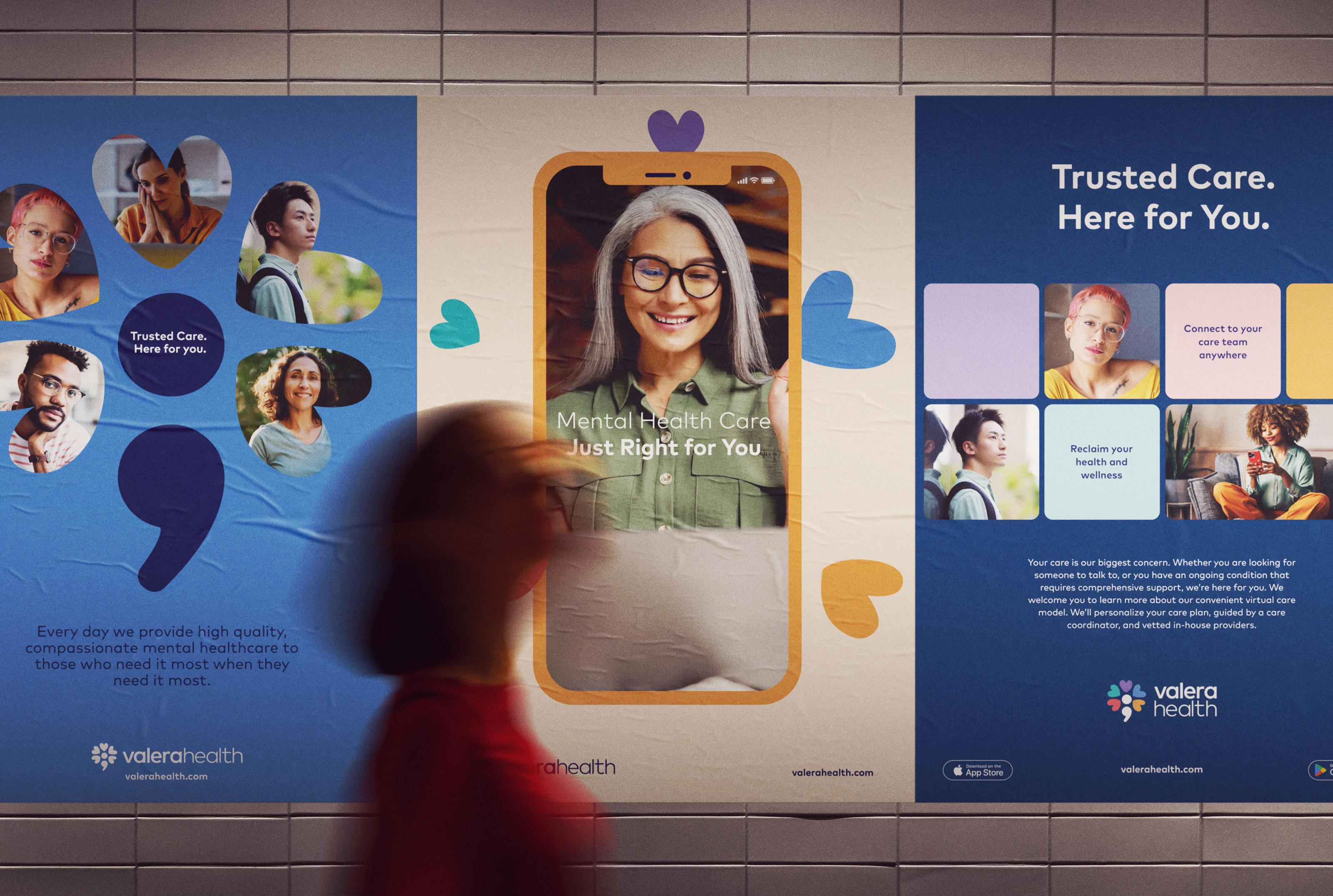
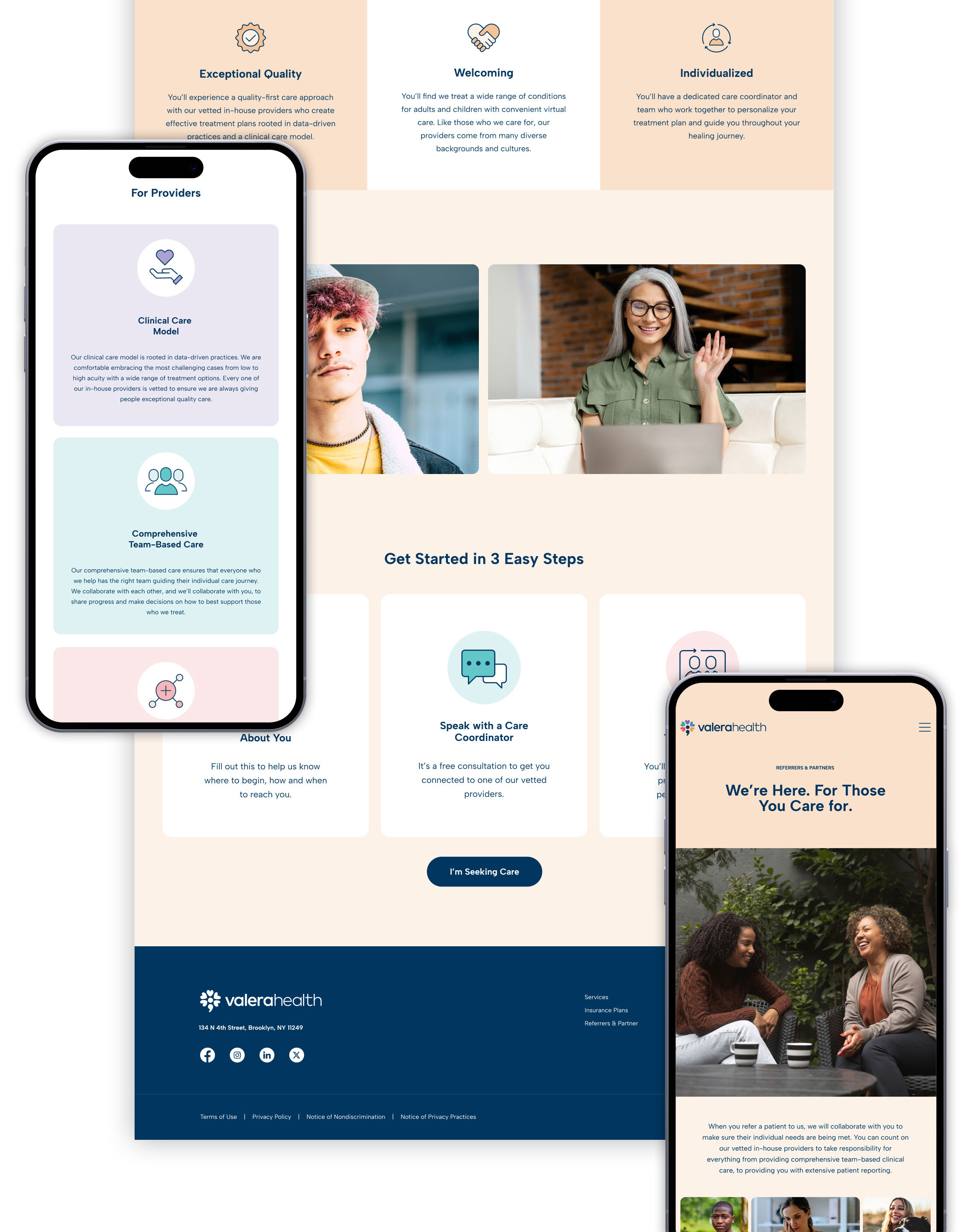
Analyzing the client’s core values, target demographics, and industry landscapes helped us select a color palette that reflects the brand’s personality and objectives. To present the brand as approachable, credible, and optimistic, we used various tints of vibrant blue, purple, green, red, and yellow. Warmer and darker tints of these colors create the feeling of compassion and acceptance for patients of all backgrounds as they explore the website. We avoided using bright white background elements to keep the website’s aesthetic from feeling sterile, empty, or isolating. Instead of using white throughout the website, we incorporated warm, earthy tones that are more welcoming and comforting.

Logo Visuals and Design
Logos support brands’ visual identities, so design agencies choose logo colors that are appealing and convey a brand’s purpose and identity. A financial institution might have shades of blue to project reliability and security. A children’s toy company can incorporate vibrant yellows or oranges to evoke a sense of playfulness and joy.
For Valera Health, our team incorporated a variety of colors in the logo to represent the company’s emphasis on diversity and acceptance. We used repeating heart shapes with unique colors in Valera Health’s logo to create a positive first impression on patients. These colorful hearts represent the individuality of each patient and how they’re welcomed to the practice and treated with compassion. Using color effectively in the logo design enhances brand recognition and recall, strengthening patients’ connection to the company.

Brand Identity and Color
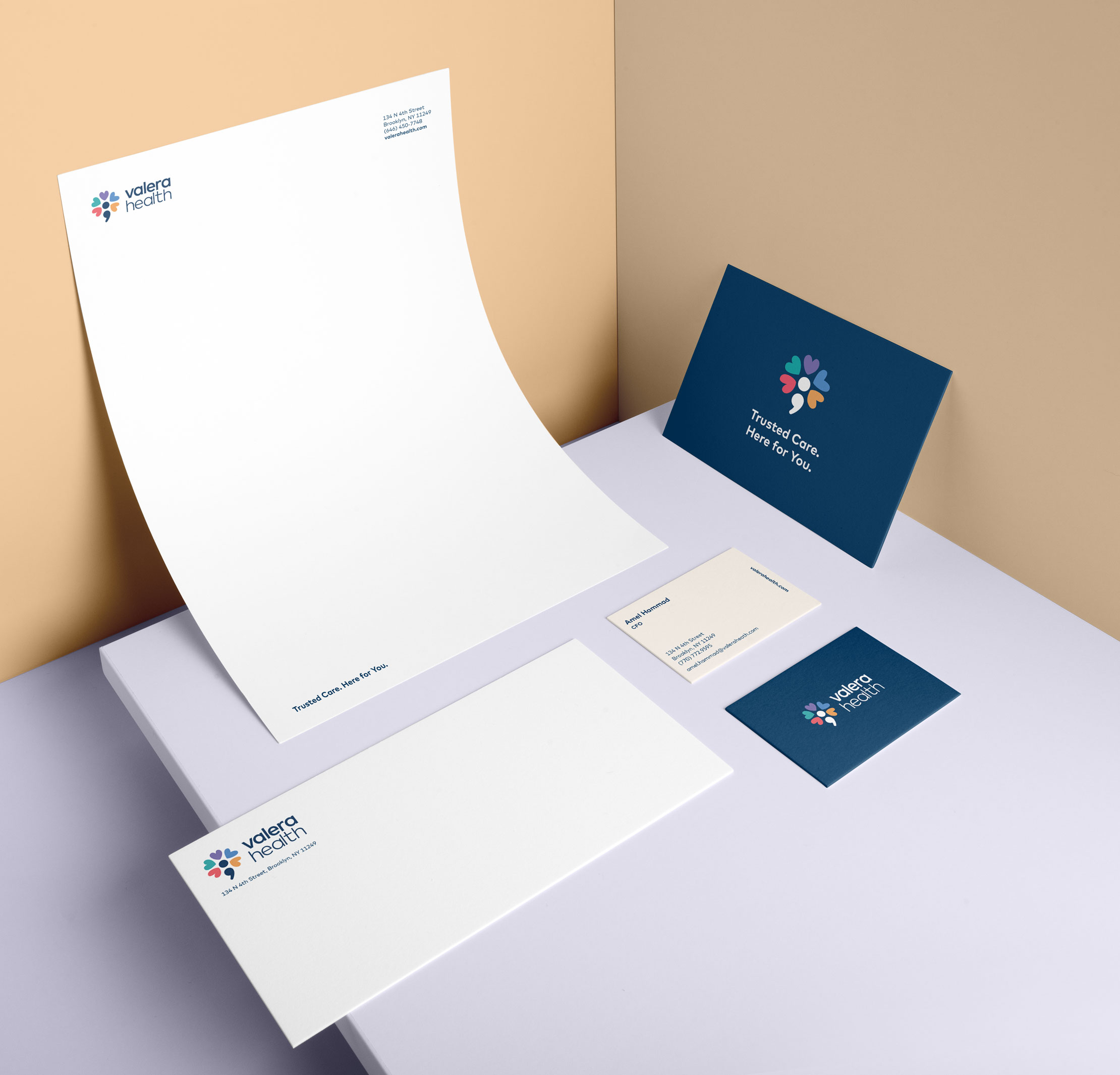
Once our clients approve the color palette and logo design, our designers can apply the colors consistently across all platforms and logo formats. Consistent color usage helps businesses’ marketing materials become more recognizable and memorable. Some ways our team applies branded color palettes include business cards, letterheads, digital assets, and other advertising materials.
Our website design for Valera Health included consistent color application on each webpage to create a uniform brand presence that strengthens recall and reinforces the desired emotional connection with patients. Part of Valera Health’s brand identity is quality-focused care, so we designed a high-quality, polished website that communicates the same message on each page. Our agency helps clients implement new designs and branding materials to confirm all colors are accurate and used correctly.

Website Design and Marketing
Branding agencies design website layouts and marketing collateral using color theory to create intuitive navigation. This draws users to certain elements and evokes an emotional response from webpage visitors. We used colors to guide the viewer’s eye through Valera Health’s website, highlighting key information with various tints of the logo colors. Using bolder colors on call-to-action buttons and section headings simplifies the user experience and increases conversion rates.

Explore Brand Design Agency Services
Brand design agencies like GreyBox Creative use colors strategically to help companies like Valera Health differentiate themselves from competitors within their industries. By analyzing competitors’ branding elements and consumers’ preferences, our agency can develop a unique color strategy and apply it to various marketing materials. This strategic approach helps capture audience attention and establish a credible and recognizable brand identity. Contact the GreyBox Creative team today to learn more about how we create memorable logos and other brand messaging.